
Reporting Dashboard
Project Overview
Redesign of an employee time-reporting dashboard from an early proof of concept into a cohesive, enterprise-ready experience. By introducing consistent UI patterns, streamlined navigation, improved color accessibility to meet WCAG standards, and role-based access controls, the solution enhanced usability while maintaining the functionality and privacy requirements of sensitive workforce data.

Timeline
3 months
Software
Figma
JIRA
Confluence
Methods
Design Systems
Accessibility (WCAG)
Information Architecture
User Flows
Wireframing
Prototyping
Developer Collaboration
Platform
Enterprise web application, optimized for desktop with tablet-responsive layouts.
Deliverables
Dashboard UX redesign
Reusable design system and UI components
Improved navigation and filtering experience
Role-based access and privacy workflows
WCAG-compliant color and contrast updates
My Role
Led end-to-end UX redesign
Defined UI standards and reusable components
Applied branding and visual design updates
Improved navigation, filtering, and usability
Designed role-based access experiences
Resolved accessibility issues using WCAG best practices
Partnered with developers through implementation
DISCOVER
Problem Statement
Program Managers need a way to quickly analyze employee time-tracking and project allocation data because inconsistent interfaces, unclear navigation, and complex permission structures make it difficult to find and interpret the information needed for workforce planning.
Solution Statement
Our solution will establish a unified dashboard experience with consistent design patterns, simplified navigation, and role-based access views so that users can efficiently locate, understand, and act on reporting data without confusion.
We will measure the application's success by reduced navigation friction, improved usability feedback, and greater confidence in workforce planning decisions.
PROJECT
Developer Concepts
Concept reporting portal experience
The company had recently introduced required employee time tracking, but managers had no easy way to view or make sense of the data being collected. To solve this, two developers were asked to create dashboards that would surface time-tracking information and help managers make staffing and resource decisions.
As the project evolved, it became clear that the two dashboard concepts were heading in very different directions. Each had its own visual style, navigation patterns, and components, with little alignment to the company's existing Design System. I was brought in to create a more consistent experience, apply brand standards, and introduce reusable components that could scale across the application. Working closely with the developers, I helped unify the experience without sacrificing the functionality that the business needed.
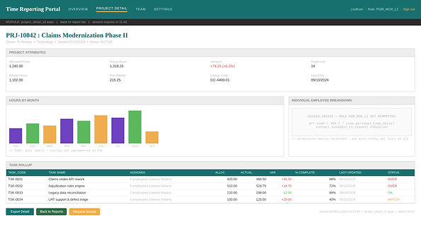
Concept time tracking experience

Updated Experience
Update to reporting overview
I used components, colors, and patterns from the company's Design System to create a more consistent experience across the application. Because the original dashboard concepts had been built independently, I worked closely with both developers to understand the reasoning behind their decisions and make sure the core functionality remained intact while improving consistency and usability. Their feedback throughout the process was important in helping build alignment around the changes.
I also designed a set of custom icons to represent application-specific status indicators that weren't available in the existing Design System. To support future projects, I partnered with the team to have those icons incorporated into the Design System so they could be reused by other designers.
The collaboration was a huge success. During a stakeholder meeting, one of the developers gave me a personal shout-out, sharing how much the UX work improved the product and helped make the experience easier to understand, navigate, and use. That recognition reinforced the value of bringing design and development together early in the process.

Update to time report

Permissions Based Experience
Senior Executive View - full access
Another important consideration for this project was role-based access. Because the application contained sensitive employee, project, and financial data, users had access to different information depending on their role in the organization. Senior executives had access to all reporting data, while managers could view reports related to their own programs and associated projects. Individual employees had access only to high-level project information and could not view financial or cost-related data.

Senior Executive View - Tablet size
Device usage was another key consideration. Many senior executives regularly accessed company applications on iPads, making tablet support a high-priority requirement. As part of the design process, I evaluated layouts, navigation patterns, and data visualizations to keep the reporting experience usable and readable on tablet-sized screens while still supporting leadership users' complex reporting needs.

Program Manager View - tailored access
One challenge we identified was that program ownership could change over time. When a program transferred to a new manager, that person often needed visibility into reporting data they didn't currently have permission to access. To support these situations, I helped define an access-request workflow that allowed users to request additional permissions when needed. This ensured managers could gain appropriate access without compromising the application's privacy and security requirements.

Employee View - limited access
Designing for these different permission levels, workflows, and device needs required creating multiple experience paths and carefully deciding what information each audience should see. The goal was to ensure every user could access the data they needed, regardless of role or device, while protecting sensitive information and maintaining a consistent experience across the application.

Next Steps
The next phase of this project would focus on validating design decisions through user testing, expanding the newly established design patterns across related applications, and continuing to refine role-based experiences for managers, employees, and executives. As reporting needs evolve, future iterations could introduce more personalized dashboards, advanced filtering, and additional reporting options while maintaining the consistency established through the Design System