
Roadmap
Timeline-Based Planning
Project Overview
Enterprise-wide Strategic Portfolio Manager (SPM) was created to help organizations manage work across portfolios, but users lacked a timeline view of initiatives and projects. This project delivered the first Roadmap experience, enabling users to visualize progress over time, plan more effectively, and understand dependencies between initiatives.

Timeline
6 months
Tools
Figma
Miro
Copilot
Platform
Enterprise Software
Deliverables
Wireframes, low and high fidelity prototypes with iterations, comparative analysis, presentations to stakeholders, handoff documents.
My Role
Defining the end-to-end roadmap experience
Designing wireframes and high-fidelity concepts
Establishing scalable interaction patterns
Ensuring alignment with the company's Design System
Partnering with Product and Engineering through design reviews and handoff
DISCOVER
Problem Statement
Strategic portfolio managers need a way to view and manage work on a timeline because list-based planning makes it difficult to understand progress, milestones, and long-term initiative relationships across multiple quarters and years.
Solution Statement
Our solution will introduce a scalable Roadmap experience that visualizes work across time with milestones and flexible timeframe controls so that portfolio managers can quickly understand plans, track progress, and make better-informed decisions, which measures success by increased roadmap adoption, stronger engagement, reduced planning confusion, and improved task completion rates.
Research
I reviewed several roadmap and portfolio management tools to understand how they approached timeline planning, information hierarchy, and usability. While many solutions offered powerful planning capabilities, they often came with added complexity that made them harder to learn and navigate.
Competitive Analysis
“When leadership asks how initiatives overlap, I usually end up exporting data and building my own timeline."
“I need to understand what's happening this quarter and next quarter at a glance. A spreadsheet or list doesn't give me that context."

Research Insights
The research highlighted an opportunity to create a roadmap experience that focused on clarity first. Rather than introducing every possible feature, the goal was to help users quickly understand work over time, track milestones, and make planning decisions with confidence. At the same time, the experience needed to be flexible enough to support future enhancements without changing the core interaction model. This aligned with the project's goal of improving portfolio visibility while laying the groundwork for future capabilities.
Key Takeaways
-
Prioritize simplicity and ease of use.
-
Make timelines and milestones easy to understand at a glance.
-
Reduce cognitive load by focusing on core planning needs.
-
Build scalable interaction patterns that can support future features such as dependencies and hierarchy.
PROJECT
Wireframes
Early concept wireframe
My initial concepts explored a multi-level roadmap view that allowed users to see several layers of work at once. While this provided more context, it quickly became clear that the experience was becoming too dense and difficult to navigate.

Lofi Concept
Another factor was development effort. While a more advanced dependency view would have added value, it also came with a significant engineering cost and risk to the timeline.

Iteration wireframe - closer to business goal
Viewing one level of items at a time - utilizing filters
Through iteration and stakeholder discussions, I shifted focus toward simplicity. Instead of displaying multiple levels simultaneously, the roadmap was designed to show one level at a time, supported by intuitive filters that helped Program Managers quickly find the information they needed. This approach reduced cognitive load, aligned with project constraints, and created a scalable foundation for future enhancements such as hierarchy and dependencies.
To keep the project moving, we prioritized a simpler MVP experience that addressed core user needs. More sophisticated visualizations were intentionally deferred as a future enhancement, giving us the opportunity to validate the concept before investing in added complexity.
Key takeaway: Sometimes the best design decision isn't adding more information, it's helping users stay focused on the right information.
Final hi-fi screen for development - simplified with filters

Visualizing Dependencies and Milestones
Visualizing dependencies and milestones was one of the toughest design challenges in this project. A single program could be dependent on other programs, while also having other work dependent on it. Finding a way to communicate those relationships without creating a cluttered roadmap required a lot of exploration.
Milestones presented a similar challenge. They needed to stand out as key moments in the timeline while still fitting naturally into the overall roadmap experience.
Early concept dependency / milestone visualization wireframe

Hi-fi screen visualization with lower development scope
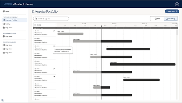
Because of time constraints and the complexity involved, we chose not to solve every dependency scenario in the MVP. Instead, we focused on creating a simple, easy-to-understand roadmap experience and identified dependency visualization as a fast-follow opportunity after launch. This decision helped us deliver value sooner while leaving room for future enhancements.

Other Considerations
The roadmap needed to support different planning horizons depending on the level of work being viewed. At higher levels, users needed a long-term view spanning years, while lower levels required a more granular monthly perspective. Determining how and when to transition between these views was one of the more complex aspects of the design.
Selection options for time increment - Level 1

Selection options for time increment - Level 2
To solve this, I partnered closely with engineering to understand both the user needs and technical constraints. Together, we established a timeline model that provided the right level of context at each level of the hierarchy while keeping the experience simple and predictable for Program Managers.

Visualization of times selected outside of the current date range - provides development context for edge cases


Collapsed Roadmap View
One piece of feedback we heard early on was that Program Managers often needed to view a large number of items at once. The fully expanded roadmap provided valuable detail, but it wasn't always practical for scanning an entire portfolio.
To solve this, I created a collapsed view that allowed users to fit more items on the screen and quickly understand what was happening across their programs. I collaborated closely with the lead engineer to determine what information should remain visible in the condensed state and what could be revealed on demand, helping strike the right balance between visibility and simplicity.

Final hi-fi screens for development of roadmap experience

Final hi-fi screens for development - selected state - responsive design

Next Steps
Launching the MVP was an important first step, but it was always intended to be the foundation for a more robust roadmap experience. The next focus was dependency and milestone visualization, helping program managers better understand relationships between initiatives and identify key moments in the delivery timeline. Future iterations would build on the roadmap framework introduced in the MVP, adding the depth needed to support more strategic planning and portfolio management use cases.